Past Layouts
"Vencake"
.png)
First design. I just wanted something cute yet mobile-friendly. I made a pastel background for it (and might use it again tbh)
.png)
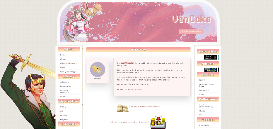
I like small fonts so changed the navbar entirely. The pixel background is from Pokémon and looked cute, but I didn't like the overall aesthetic so changed it completely in the current version.

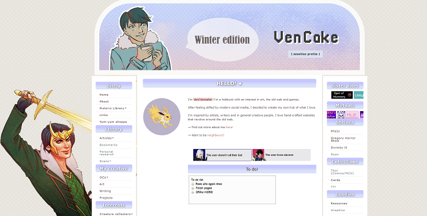
The chalice layout is one of my old web faves. I want to do a styleswitcher in the future!

Summer edition of the above!

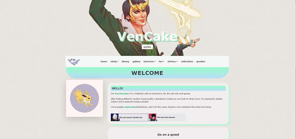
Current to be added. Green is my fave colour, and gradients are GORGEOUS. This design was inspired by forum skins.

It's based on forums as well as oldweb fansites.

Back to chalice! Start of 2023 theme
Chatbox (retired)
No longer in use. I put it in the right sidebar, but I prefer guestbooks. I mostly kept it there for the "old web chalice" aesthetic which I dearly miss.
Guestbook (retired)
Here.
No longer in use. Lost interest in Guestbook style stuff. Not sure...maybe I'll bring it back in the form of something else?
